Argos is is a multi-platform design brand specialising in interior consulting, design, styling and creative direction. The team at Argos is focused on guiding people in discovering the potential of interior spaces to create their ideal and absolute dream sanctuaries. Their work uses innovative modern design and frequently leverages unusual materials or techniques to create striking interiors – qualities that they wanted reflected in their branding.
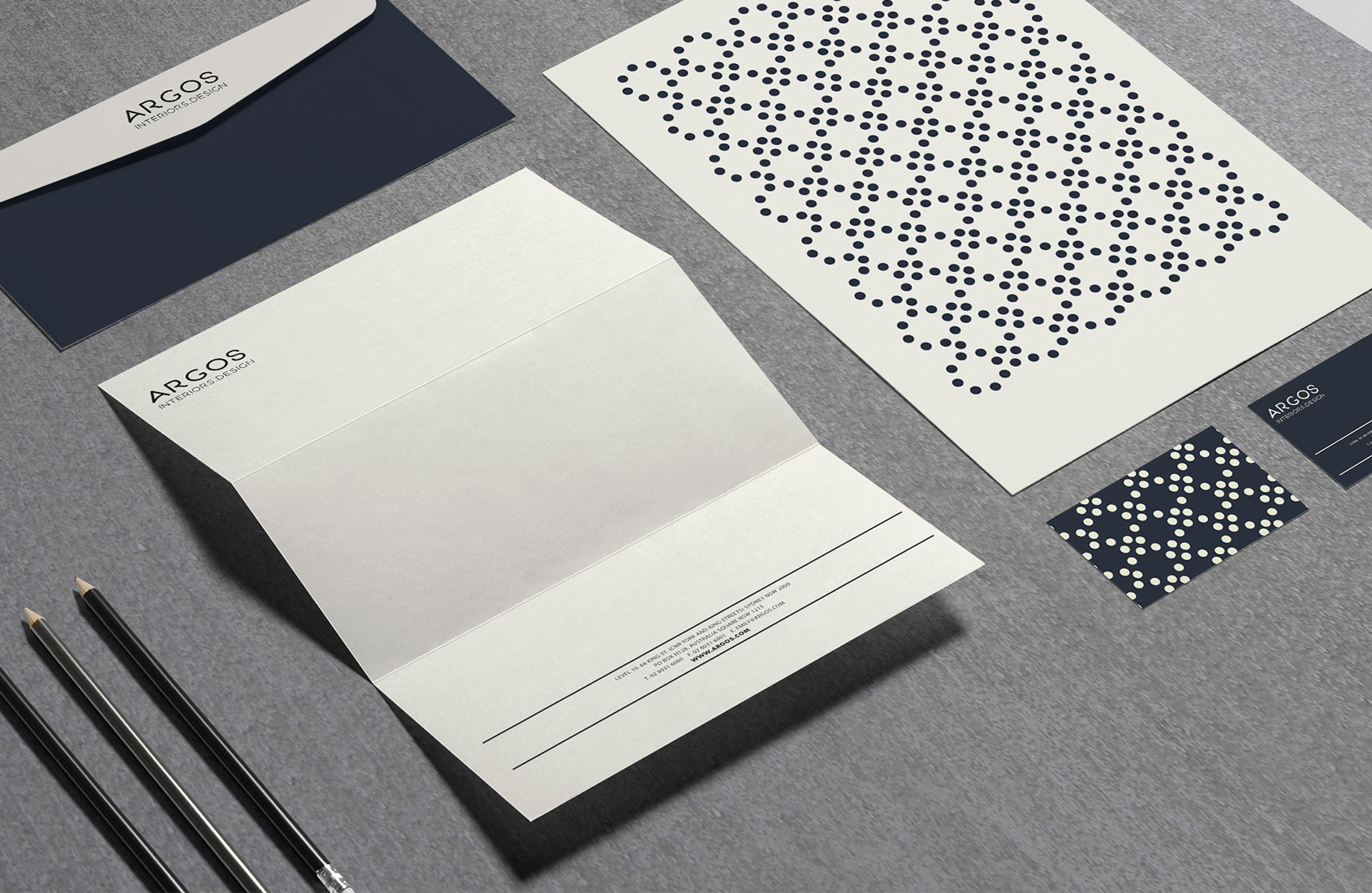
The brand is built from simple, replicated elements – the circle grid structure is manipulated in many different ways to create a variety of patterns. The potential for using different patterns is endless while remaining recognisable as part of the Argos branding. The logo’s simple characters, light line weights and crafted origins share the values of clarity and honesty that underpin the designer’s ethos, and most importantly, it is unique to them. It becomes a recognisable and consistent asset. The curvaliniar nature of the logo’s letterforms combined with the rich navy colour, white textured paper and gold foil pay homage to the designer’s Greek heritage, including the Aegaean sea and the architecture of the Cyclades. We wanted to create a brand of subtle visual & tactile sensations – luxury, but not splendour.
– brand guidelines
– logo and visual styleguide
– stationery
– website
![]()