BreastScreen NSW needed to provide a shift in perception among the target audience from a government-provided medical service, to an engaging and personalised program for women. Participation of women of the target age group of women in NSW in this free, government-funded program is approximately 50%.
Based on thorough quantitative research done within the target group, a refreshed and revitalised brand look for BreastScreen was devised. Notewell saw an opportunity for the brand refresh to inspire action from the women of NSW through creating a campaign brand that steers away from the original soft, muted tones and themes of breast screening and rather appeals to the more confident and empowered woman. The essence of the creative concept acts as a modern platform aimed at bringing awareness and encouraging participation from women of the target age.
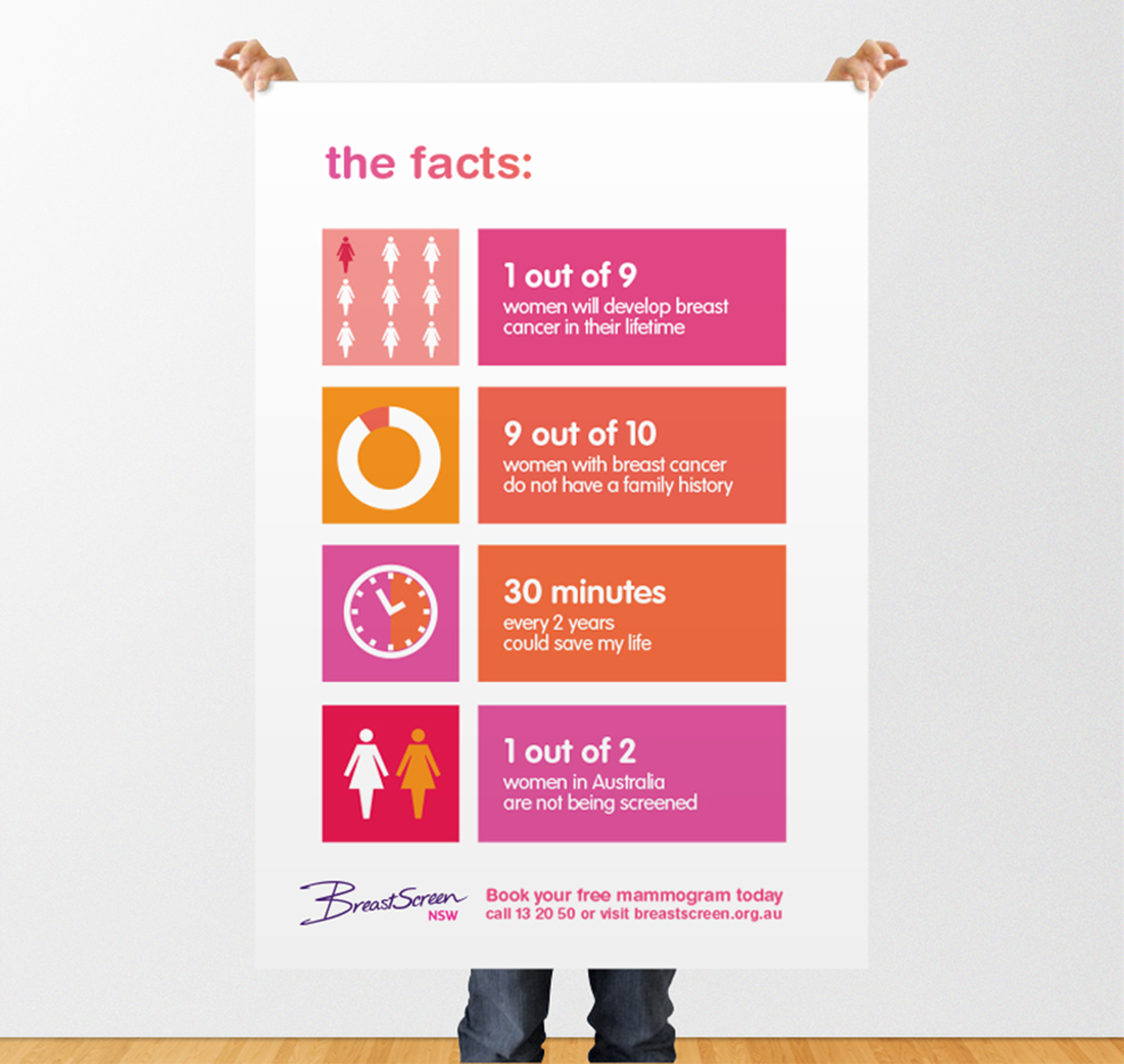
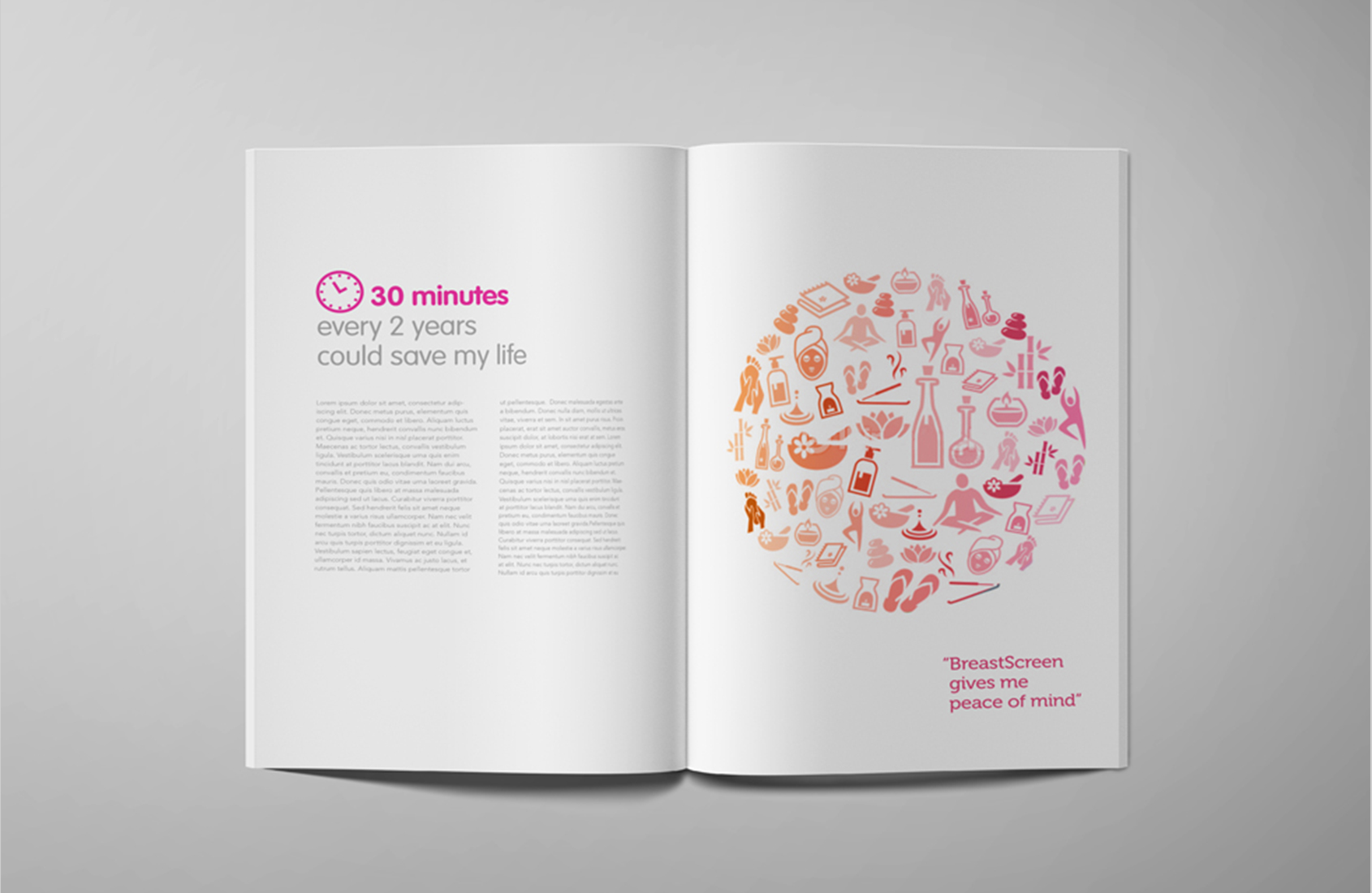
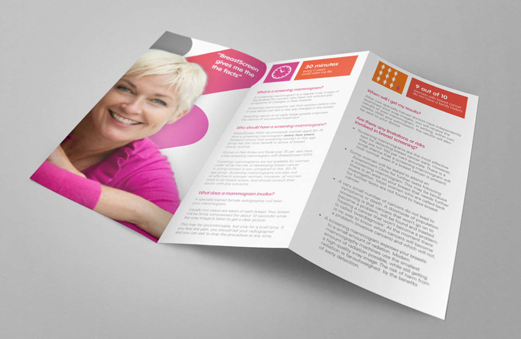
On a purely practical level, graphical shapes and overlays create a visual system that doesn’t need to solely rely on photography. Bold statement-like language and friendly open typography is simple yet effective. Fact-style infographics help fast and easy digestion of information at a glance and act as powerful motivators whilst the bright and bold colours and gradients chosen are feminine yet still in keeping with the preferred warmer palette. This choice of colours help differentiate BreastScreen from other breast cancer charities and organisations that solely use pink. The photography enhances the positive brand elements of empathy and care and create a more personal feel. Women represented are of different ages and backgrounds and appear relaxed, empowered and trustworthy; they are ‘everyday’ women.
– brand guidelines
– brochures
– van design
– direct mailer
– posters